');}.category-filters a:hover .checkbox {border-color: #e65330;}.design-2 .content-area.latest-post-container,.design-3 .regular-posts {grid-template-columns: repeat(3, 1fr);}.checkbox .check-table svg {stroke:#e65330;}html{scroll-behavior:smooth;}.article-content,#commentform input, #commentform textarea,.reply a,.woocommerce #respond input#submit, .woocommerce #respond input#submit.alt,.woocommerce-address-fields__field-wrapper input,.woocommerce-EditAccountForm input,.wpcf7-form input,.wpcf7-form textarea,.wpcf7-form input.wpcf7-submit,.grid-container .grid-item,.design-1 .featured-post-img,.design-1 .regular-post-img,.design-1 .lastest-post-img,.design-2 .featured-post-img,.design-2 .regular-post-img,.design-2 .lastest-post-img,.design-2 .grid-item,.design-2 .grid-item .grid-image-container,.design-2 .regular-post,.home.design-2.asap-box-design .article-loop,.design-3 .featured-post-img,.design-3 .regular-post-img,.design-3 .lastest-post-img {border-radius: 7px !important;}.pagination a, .pagination span, .nav-links a {border-radius:50%;min-width:2.5rem;}.reply a {padding:6px 8px !important;}.asap-icon,.asap-icon-single {border-radius:50%;}.asap-icon{margin-right:1px;padding:.6rem !important;}.content-footer-social {border-top-left-radius:7px;border-top-right-radius:7px;}.item-featured,.item-new,.average-rating-loop {border-radius:2px;}.content-item-category > span {border-top-left-radius: 3px;border-top-right-radius: 3px;}.woocommerce span.onsale,.woocommerce a.button,.woocommerce button.button, .woocommerce input.button, .woocommerce a.button.alt, .woocommerce button.button.alt, .woocommerce input.button.alt,.product-gallery-summary .quantity input,#add_payment_method table.cart input,.woocommerce-cart table.cart input, .woocommerce-checkout table.cart input,.woocommerce div.product form.cart .variations select {border-radius:2rem !important;}.search-home input {border-radius:2rem !important;padding: 0.875rem 1.25rem !important;}.search-home button.s-btn {margin-right:1.25rem !important;}#cookiesbox p,#cookiesbox a {color: #FFFFFF;}#cookiesbox button {background: #FFFFFF;color:#e65330;}@media (max-width: 1050px) and (min-width:481px) {.article-loop-featured .article-image-featured {border-radius: 7px !important;}}@media (min-width:1050px) { #autocomplete-results {border-radius:3px;}ul.sub-menu,ul.sub-menu li {border-radius:7px;}.search-header input {border-radius:2rem !important;padding: 0 3 0 .85rem !important;}.search-header button.s-btn {width:2.65rem !important;}.site-header .asap-icon svg { stroke: #FFFFFF !important;}}@media (min-width:1050px) {.content-footer {border-top-left-radius:7px;border-top-right-radius:7px;}}.article-content {height:196px;}.content-thin .content-cluster .article-content {height:160px !important;}.last-post-sidebar .article-content {height: 140px;margin-bottom: 8px}.related-posts .article-content {height: 120px;}.asap-box-design .related-posts .article-content {min-height:120px !important;}.asap-box-design .content-thin .content-cluster .article-content {heigth:160px !important;min-height:160px !important;}@media (max-width:1050px) { .last-post-sidebar .article-content,.related-posts .article-content {height: 150px !important}}@media (max-width: 480px) {.article-content {height: 180px}}@media (min-width:480px){.asap-box-design .article-content:not(.asap-box-design .last-post-sidebar .article-content) {min-height:196px;}.asap-loop-horizontal .content-thin .asap-columns-1 .content-cluster .article-image,.asap-loop-horizontal .content-thin .asap-columns-1 .content-cluster .article-content {height:100% !important;}.asap-loop-horizontal .asap-columns-1 .article-image:not(.asap-loop-horizontal .last-post-sidebar .asap-columns-1 .article-image), .asap-loop-horizontal .asap-columns-1 .article-content:not(.asap-loop-horizontal .last-post-sidebar .asap-columns-1 .article-content) {height:100% !important;}.asap-loop-horizontal .asap-columns-2 .article-image,.asap-loop-horizontal .asap-columns-2 .article-content,.asap-loop-horizontal .content-thin .asap-columns-2 .content-cluster .article-image,.asap-loop-horizontal .content-thin .asap-columns-2 .content-cluster .article-content {min-height:140px !important;height:100% !important;}.asap-loop-horizontal .asap-columns-3 .article-image,.asap-loop-horizontal .asap-columns-3 .article-content,.asap-loop-horizontal .content-thin .asap-columns-3 .content-cluster .article-image,.asap-loop-horizontal .content-thin .asap-columns-3 .content-cluster .article-content {min-height:120px !important;height:100% !important;}.asap-loop-horizontal .asap-columns-4 .article-image,.asap-loop-horizontal .asap-columns-4 .article-content,.asap-loop-horizontal .content-thin .asap-columns-4 .content-cluster .article-image,.asap-loop-horizontal .content-thin .asap-columns-4.content-cluster .article-content {min-height:100px !important;height:100% !important;}.asap-loop-horizontal .asap-columns-5 .article-image,.asap-loop-horizontal .asap-columns-5 .article-content,.asap-loop-horizontal .content-thin .asap-columns-5 .content-cluster .article-image,.asap-loop-horizontal .content-thin .asap-columns-5 .content-cluster .article-content {min-height:90px !important;height:100% !important;}}@media(max-width:1050px) {.the-content .post-index {position:sticky;margin-top: 0 !important;box-shadow: 0 10px 30px rgba(0, 0, 0, 0.15);z-index:9;}.asap-box-design .the-content .post-index.width100vw {box-shadow: 0 10px 30px rgba(0, 0, 0, 0.15) !important;}.the-content .post-index li{margin-left:2px !important;}#index-table{display:none;}.check-table svg {transform: rotateX(180deg);}.asap-content-box {overflow:visible !important;}.asap-box-design .post-thumbnail {margin:1rem 0 !important;border-top-right-radius: 0.5rem;border-top-left-radius: 0.5rem;overflow: hidden;}.asap-back {z-index:9 !important;}}@media(min-width:1050px) {.the-content .post-index .btn-show {display:none !important;}}@media(max-width:1050px) {.the-content .post-index {top:0px;z-index:99999;}}.the-content .post-index {background:#e653301A !important;border:1px solid #e65330 !important;}.the-content .post-index .checkbox .check-table svg {stroke-width:1 !important;}@media(max-width:1050px) {.the-content .post-index {background:#fff !important;}}@media(max-width: 480px) {h1, .archive .content-loop h1 {font-size: calc(38px - 8px);}.asap-hero h1 {font-size: calc(32px - 8px);}h2 {font-size: calc(32px - 4px);}h3 {font-size: calc(28px - 4px);}.article-loop-featured .article-image-featured {border-radius: 7px !important;}}@media(min-width:1050px) {.content-thin {width: calc(95% - 300px);}#menu>ul {font-size: calc(18px - 2px);} #menu ul .menu-item-has-children:after {border: solid #FFFFFF;border-width: 0 2px 2px 0;}}@media(max-width:1050px) {#menu ul li .sub-menu li a:hover { color:#e65330 !important;}#menu ul>li ul>li>a{font-size: calc(18px - 2px);}}.last-post-sidebar {padding:0;margin-bottom:2rem !important;}.last-post-sidebar .article-loop a {display:flex !important;align-items: center;}.last-post-sidebar .article-loop p {width:100%;text-align:left !important;margin-bottom:0;font-size: calc(18px - 2px) !important;}.last-post-sidebar .article-content {margin-bottom:0 !important;margin-right:.5rem;min-width:120px;}.last-post-sidebar .article-image {height:90px !important;min-width:120px;}.last-post-sidebar article {margin-bottom:1.5rem !important;}.asap-box-design .last-post-sidebar .article-loop a {flex-direction: row;}.asap-box-design .last-post-sidebar .asap-box-container p {margin-bottom:0 !important;padding:0 10px 0 10px !important;} .asap-box-design .last-post-sidebar article:last-child { margin-bottom:3.5rem !important;}.last-post-sidebar .article-content {height:90px !important;}.asap-date-loop {font-size: calc(18px - 5px) !important;text-align:center;}.the-content h2:before,.the-content h2 span:before {margin-top: -70px;height: 70px; }.asap-content-logo-top {background: #f2f2f2;}.site-header-content{justify-content:center;}@media (max-width: 1050px){.site-logo img{max-height:36px;}#menu { margin-top: 60px;}.asap-content-logo-top {padding: 0 1rem !important;z-index: 9999;width: 100%;height:60px;}}@media (min-width: 1050px){.site-header-content-top {padding-left:1rem;padding-rigth:1rem;justify-content:space-between;}}@media (max-width: 1050px){.asap-content-logo-top {position:fixed;}}@media(min-width:1050px) {.site-header {box-shadow: 0 1px 12px rgb(0 0 0 / 30%);}.asap-content-logo-top {position: relative;z-index:9999;overflow:hidden;}}@media(max-width:1050px) {.asap-content-logo-top {box-shadow: 0 1px 12px rgb(0 0 0 / 30%);}}.content-footer .widget-area {padding-right:2rem;}footer {background: #e65330;}.content-footer {padding:20px;}.content-footer p.widget-title {margin-bottom:10px;}.content-footer .logo-footer {width:100%;align-items:flex-start;}.content-footer-social {width: 100%;}.content-single,content-page {margin-bottom:2rem;}.content-footer-social > div {max-width: calc(1140px - 32px);margin:0 auto;}.content-footer .widget-bottom-area {margin-top:1.25rem;}.content-footer .widget-bottom-title {display: none;}@media (min-width:1050px) {.content-footer {padding:30px 0;}.content-footer .logo-footer {margin:0 1rem 0 0 !important;padding-right:2rem !important;}}@media (max-width:1050px) {.content-footer .logo-footer {margin:0 0 1rem 0 !important;}.content-footer .widget-area {margin-top:2rem !important;}}@media (max-width: 1050px) {header label {width: 64px;height: 64px;position: fixed;padding:0;right: 1.5rem;bottom: 6rem;border-radius: 50%;-webkit-box-shadow: 0px 4px 8px 0px rgba(0,0,0,0.5);box-shadow: 0px 4px 8px 0px rgba(0,0,0,0.5);background-color: #fff;-webkit-transition: 300ms ease all;transition: 300ms ease all;z-index:101;display: flex; align-items: center;}.site-header-content {justify-content: center;}.line {background:#282828 !important;}.circle {margin:0 auto;width: 24px;height: 24px;}}.search-header input {background:#FFFFFF !important;}.search-header button.s-btn,.search-header input::placeholder {color: #484848 !important;opacity:1 !important;}.search-header button.s-btn:hover {opacity:.7 !important;}.search-header input:not([type=submit]):not([type=radio]):not([type=checkbox]):not([type=file]) {border-color: #FFFFFF !important;}@media(min-width:768px) {.design-1 .grid-container .grid-item.item-2 h2,.design-1 .grid-container .grid-item.item-4 h2 {font-size: calc(25px - 8px) !important;}}@media (max-width: 768px) {.woocommerce ul.products[class*="columns-"] li.product,.woocommerce-page ul.products[class*="columns-"] li.product {width: 50% !important;}}
RECETUM Noticias Marqués de Murrieta se servirá en el avión más grande y lujoso del mundo Marqués de Murrieta se servirá en el avión más grande y lujoso del mundo hace 9 años · Actualizado hace 5 años
Marqués de Murrieta se servirá en el avión más grande y lujoso del mundo 
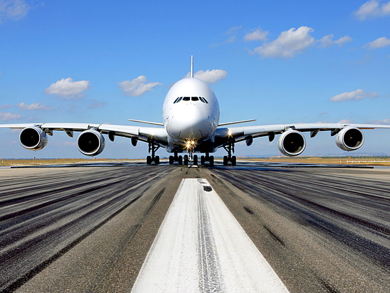
Marqués de Murrieta se servirá en el avión más grande y lujoso del mundo. Será el Airbus A380, donde se podrá degustar del vino de esta bodega española. Estamos hablando de que este avión se convierte casi en un hotel ya que tiene habitaciones privadas con cama y ducha. Se podrán disfrutar de productos de Bvlgari, un centro de spa y, como no, una carta de vinos de lujo. Vinos como Don Pèrignon, Pavellon Rouge o ChateauxMargaux, estarán acompañados por dos vinos de la bodega española. En concreto serán Dalmau y Marqués de Murrieta Reserva.
Esta noticia no hace que demostrar claramente que esta bodega española y sus vinos son uno de los referentes de los vinos de lujo en nuestro país.
El avión constará de dos pisos en los que encontramos 427 asientos en categoría turista y cabinas privadas First Class y camas en categoría Business. En la parte posterior del avión se ubicarán tanto el restaurante como el bar, en los cuales se podrán disfrutar los vinos anteriormente indicados y otros de igual renombre. Sin duda se podrá disfrutar de una excelente cena maridada con cualquiera de estos espléndidos vinos.
Te puede interesar!