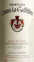
Château Canon-La Gaffelière St.-Emilion 2010
hace 11 años · Actualizado hace 5 años

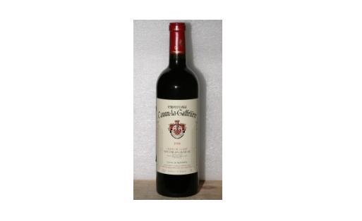
Château Canon-La Gaffelière St.-Emilion 2010 está considerado por Wine Spectator como el mejor vino del mundo en el año 2013 en relación calidad/precio/disponibilidad, lo que nos hace ver que estamos ante un vino de características muy especiales como es el hecho de que e le otorgase una puntuación de 96 puntos por esta revista.
Vino de Francia, perteneciente a la región de Bourdeux, que sigue a dos añadas también muy buenas y espectaculares como fueron la 2008 y 2009. Elaborado por la bodega Chateau Canon La Gaffeliere.
Se trata de un vino muy elegante en nariz con aromas muy bien definidos en el que domina la varietal Cabernet Franc, aunque no es la dominante ya que se elabora con 55% Merlot, 35% Cabernet Franc y 10% Cabernet Sauvignon. Envejecido en 70% roble nuevo. En boca la presencia y dulzura de la fruta es notable. Puede que al abrirlo en tanino resulte un poco fuerte y corpulento pero al decantarlo se consigue abrir completamente el tarro de las esencias que aporta este vino francés.
Notas de cata de este Château Canon-La Gaffelière St.-Emilion 2010:
En nariz sin duda destacan sus aromas a frutas, flores y a tierra. Detrás se perciben aromas a menta, chocolate, ciruela, vainilla y notas de café que se van abriendo a medida que el vino se oxigena.
De entrada en boca percibimos un vino fresco y sobre todo exuberante. En paso por boca se percibe claramente un vino estructurado en el que las frutas como la ciruela o la mora vuelven a estar presentes. Sedoso y cálido en el paso posee un final exquisito y una inmejorable persistencia con un final además un poco picante.
Te puede interesar!